Why Kirby Looks Different in the West: A Look at Nintendo's Localization Strategies

This article explores the fascinating evolution of Kirby's image in Western markets, contrasting it with his original Japanese portrayal. Former Nintendo employees shed light on the strategic decisions behind the changes, revealing a shift in Nintendo's global localization approach.
The "Angry Kirby" Phenomenon: A Western Marketing Tactic
The "Angry Kirby" – a fiercer, more determined Kirby often featured on Western game covers and artwork – wasn't about anger, but about broader appeal. Leslie Swan, former Nintendo Localization Director, explained that while cute characters resonate universally in Japan, Western markets, particularly with tween and teen boys, favored tougher protagonists. Shinya Kumazaki, director of Kirby: Triple Deluxe, confirmed this, noting that while cute Kirby drives Japanese sales, a "strong, tough" Kirby performs better in the US. However, he also pointed out that this wasn't universally true, citing Kirby Super Star Ultra's consistent artwork across regions.
Marketing Kirby as "Super Tuff Pink Puff"
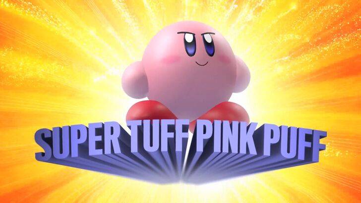
Nintendo's marketing actively aimed to broaden Kirby's appeal, particularly among boys. The "Super Tuff Pink Puff" tagline for Kirby Super Star Ultra (2008) exemplifies this strategy. Krysta Yang, former Nintendo of America Public Relations Manager, highlighted Nintendo's desire to shed its "kiddie" image during that era, emphasizing the negative perception of games labeled as such. This led to a conscious effort to portray Kirby as a more formidable combatant, shifting focus from personality to gameplay and abilities, as seen in the Kirby and the Forgotten Land (2022) marketing. While Nintendo has strived for a more well-rounded Kirby, Yang acknowledges that the "cute" perception largely prevails.
Regional Variations in Localization: A Case Study
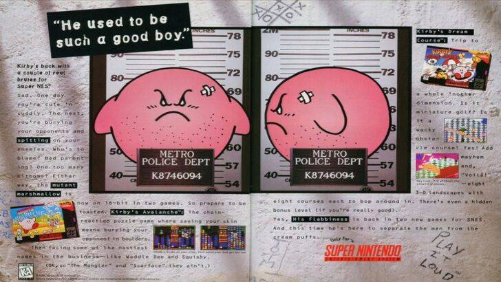
The divergence began early. A 1995 "Play It Loud" ad featuring a mugshot-style Kirby is a prime example. Subsequently, variations in Kirby's facial expression appeared across game covers, with titles like Kirby: Nightmare in Dream Land (2002), Kirby Air Ride (2003), and Kirby: Squeak Squad (2006) showcasing a more serious Kirby. Beyond facial expressions, even Kirby's color was altered. The original Kirby's Dream Land (1992) Game Boy release featured a desaturated Kirby, a decision influenced by the Game Boy's monochrome display. This was rectified in Kirby's Adventure (1993) on NES, but the initial decision highlighted the challenges of marketing a "puffy pink character" to a Western boy demographic.
A Shift Towards Global Consistency
Swan and Yang concur that Nintendo now adopts a more globalized approach. Closer collaboration between Nintendo of America and the Japanese office has resulted in more consistent marketing and localization. The company is moving away from regional variations like the altered Kirby artwork and avoiding past missteps like the 1995 ad campaign. While Yang acknowledges the benefits of global consistency for brand recognition, she also notes the potential for homogenization, potentially leading to "bland, safe marketing." The current trend, game localizers suggest, is partly due to industry globalization and the increasing familiarity of Western audiences with Japanese culture.
 LATEST ARTICLES